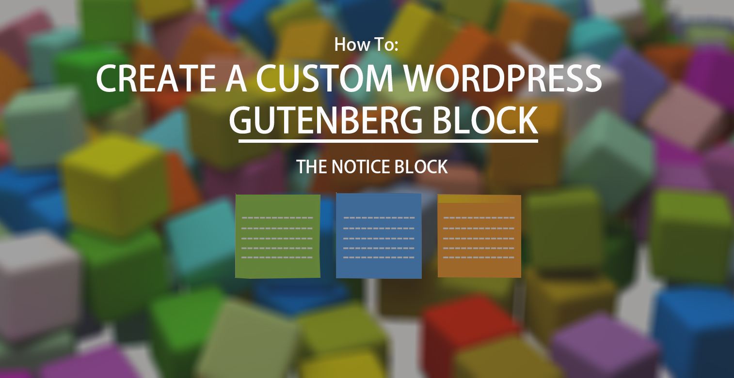
Creating a Custom WordPress Gutenberg Block (With and Without Coding)
Ever since its release back in 2003, WordPress has undergone several updates and improvements to make itself the world’s most powerful and secure CMS. Surprisingly, neither the continuous growth in the number of websites using WordPress nor its number one position in the market have made the WordPress Core Team sit back and relax.
There is no doubt WordPress has changed a lot over time, however, the recent biggest change to the CMS is the brand-new Gutenberg editor. Introduced in WordPress 5.0. Gutenberg, the new default editor, attempts to improve the overall content editing experience through “Blocks”.
Having some conceptual similarities to Shortcodes, Blocks can be anything – from paragraphs to quotes, images, embedded videos, buttons contact forms, and so on- allowing users to create and edit content in the same manner as they have been doing over the years with third-party page builders like Elementor and Divi.
Although Gutenberg already comes packed with a multitude of Blocks that you can use across your posts and pages, there might be instances when you would want to build your own Custom Block. Through this tutorial, we’ll learn the same, but before that, let’s get familiar with the basic layout and structure of a Gutenberg Block!
Gutenberg Block : Basic Layout and Structure
A Block is basically an organizational unit of several editable and reusable elements that you can rearrange as per your content requirements. Generally, there are three main user-interface sections of a Block:
The Content Area:
This is the primary interface of a Gutenberg Block, using which users can add, manipulate and adjust content according to how they want it to be displayed on the frontend.
As a general rule, this area should contain one or more placeholder attributes to instruct users about the addition of content.
The Toolbar:
The secondary interface of a Block, containing all the necessary options & controls related to content formatting. One of the best things about block toolbars is that they are highly contextual and visible on all screen sizes.
Since they feature an icon-based UI, they have a noticeable constraint as well: any controls and options that reside in the toolbar can be communicated only through icons or a group of icons. However, it largely depends on the context of usage whether or not the block needs a toolbar.
The Sidebar:
Sidebar – the tertiary interface of the Block contains only advanced or tertiary controls. Think of this area as a hub for options which is discovered only by power users.
As this section remains invisible by default on small/mobile screens and might also be collapsed in a desktop view, you should not rely on this area to show important controls. Instead, try to make all the vitally important actions available in the Toolbar.
From a technical point of view, however, a block is a simple Javascript object that uses leading-edge technologies like the WordPress REST API, React, and Redux, and is comprised of the following six key properties:
- Title: The title of the block that is displayed in the editor as a searchable label and when you’re hovering over the block in the editor.
- Icon: An icon that is shown underneath the label of the block. You can either select any icon from the built-in set of Dashicons or provide a custom SVG element.
- Category: The group in which the block will appear in the Add block menu. Currently available options are Most Used, Common Blocks, Formatting, Layout Elements, Widgets, Embeds, and Jetpack but you can also create and use a custom category.
- Attributes: Attributes are the characteristics that a block contains. For example, title, alignment, background color, text color, etc.
- Edit: The edit() is essentially a JavaScript function that lets you define how your block will appear inside the editor for the user to interact with.
- Save: Similar to the edit() function, the save() function is responsible for taking the details of a block, preparing it to save in the database and showing a visual representation of the block on the front end.
Now that you’re familiar with the basic layout and structure of a Gutenberg Block, let’s move to the next section!
Why You Might Need to Create a Custom Gutenberg Block?
Despite the block editor comes packed with a decent selection of blocks, chances are the current collection doesn’t contain the block that you’re looking for. Although, as usual, a handful of plugins (listed later in the tutorial) are already available to help you add new blocks to the editor, there’s still a possibility that you could not find the particular block that you’d like to utilize.
In such a scenario, you have only one option at your disposal – creating your own Custom Gutenberg Block. So let’s learn how to create one!
How to Manually Create a Custom Gutenberg Block?
To help you create and add your own custom blocks to the editor, WordPress offers you a nifty Block API.
In this section, we’re going to leverage the same API in order to create a new WordPress plugin that will add a “Custom Notice Block” to the editor, which shows users a notice box that accepts arbitrary text input on the backend and renders the same on the frontend.
A great advantage of creating the custom block as a plugin is that you can decouple it from your themes anytime and even deactivate it in case something goes wrong. Now let’s dive in the code step by step!
Step 1: Create a Plugin to Enqueue Your Block Scripts & Styles
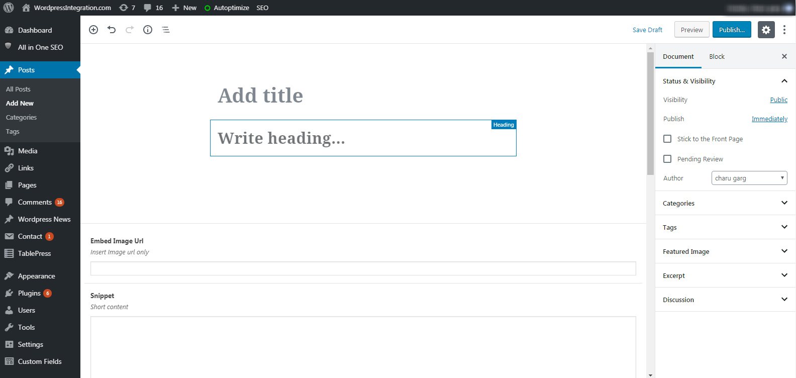
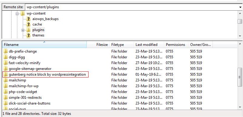
To get started, create a new folder in the wp-content/plugins directory (recommended on your local WordPress installation). I called it gutenberg notice block by wordpressintegration, but yours can be relevant to you.
In this new folder, create a new plugin.php (you can name it as per your requirements) file, then open it with a source code editor like Notepad++, and add the following code:
<?php
/**
 * Plugin Name: Gutenberg Notice Block
 * Author: WordPressIntegration
 * Author URI: https://www.wordpressintegration.com
 * Description: A simple block showing Information, Advice, Warning, and Danger notice boxes.
 */

// Load assets for wp-admin when editor is active
function gutenberg_notices_block() {
   wp_enqueue_script(
      'gutenberg-notices-block-active-editor',
      plugins_url( 'notices.js', __FILE__ ),
      array( 'wp-blocks', 'wp-element' )
   );

   wp_enqueue_style(
      'gutenberg-notices-block-active-editor',
      plugins_url( 'notices.css', __FILE__ ),
      array()
   );
}
add_action( 'enqueue_block_editor_assets', 'gutenberg_notices_block' );

// Load assets for the frontend
function gutenberg_notices_block_frontend() {

   wp_enqueue_style(
      'gutenberg-notices-block-editor',
      plugins_url( 'notices.css', __FILE__ ),
      array()
   );
}
add_action( 'wp_enqueue_scripts', 'gutenberg_notices_block_frontend' );
Basically what the above code does is create a new plugin that enqueues all the necessary block scripts and styles, and adds them to the editor. As you can see the above code is calling up notices.js and notices.css, which doesn’t exist yet but will be created in subsequent steps.
Additionally, the gutenberg_notices_block() function also adds two script dependencies – wp-blocks and wp-element. Where wp-blocks handles block registration among other functionalities, on the other hand, wp-element offers you several basic components to add to your block.
At the moment, you’ll be able to see a new plugin named “Gutenberg Notice Block” under Plugins >> Installed Plugins in your WordPress Dashboard.
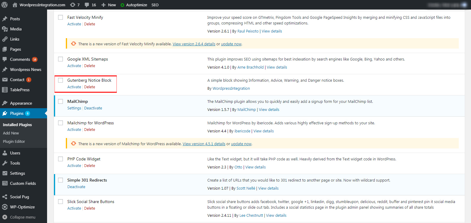
Go ahead and activate the plugin!
Step 2: Register the New Block Type
With the plugin.php file is ready, it’s time to set up the notices.js JavaScript file that is responsible for over 90% functionality of a custom block type on both the backend and front-end.
Go ahead and create the file within the same folder as plugin.php. Start by adding the code given below:
var el = wp.element.createElement;

wp.blocks.registerBlockType('gutenberg-notice-block/notices', {
	title: 'Notices',		// Block name visible to the user within the editor
	icon: 'warning',	// Toolbar icon displayed beneath the name of the block
	category: 'common',	// The category under which the block will appear in the Add block menu
	attributes: {			// The data this block will be storing
		type: { type: 'string', default: 'default' },			// Notice box type for loading the appropriate CSS class. Default class is 'default'.
		title: { type: 'string' },			// Title of Notice box in h4 tag
		content: { type: 'array', source: 'children', selector: 'p' }		/// Notice box content in p tag
	},
	edit: function(props) {
      // Defines how the block will render in the editor
      return null;
   },

   save: function(props) {
      // Defines how the block will render on the frontend
      return null;
   }
});
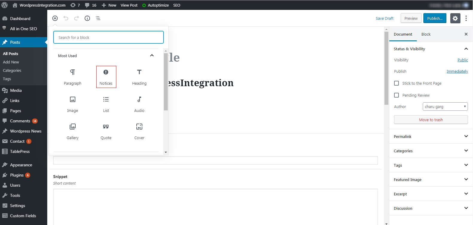
The code above registers and configures a new custom block type with the name “Notices” and an icon warning from Dashicons under the Common Blocks category in your editor. Consequently, you’re now able to access the new custom block in your editor at this point.
In the above code, we have also specified three box attributes – type, title, and content – along with their data type – string and array. The new custom block type will be storing these box attributes to our WordPress database.
Finally, we have added edit() and save() functions to the code. As we have already aforementioned what these functions do, let’s get to the coding part without any ado.
Step 3: The edit() function
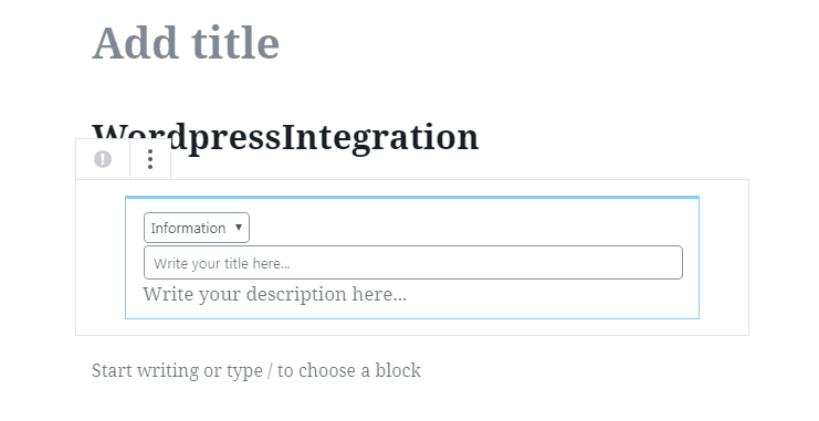
The main purpose of our new custom block type is to accomplish two things: the first one is making users able to select a notice box from the dropdown and enter the title and description in the box, and the second one is allowing users to select different notice box types so they can get an idea of what the particular notice box will look like on the frontend. To do this, add the code below to into the edit() function:
edit: function(props) {
		// Defines how the block will render in the editor

      function updateTitle( event ) {
	      props.setAttributes( { title: event.target.value } );
	   }

	   function updateContent( newdata ) {
	      props.setAttributes( { content: newdata } );
	   }

	   function updateType( newdata ) {
	      props.setAttributes( { type: event.target.value } );
	   }

		return el( 'div',
			{
				className: 'notice-box notice-' + props.attributes.type
			},
			el(
				'select',
				{
					onChange: updateType,
					value: props.attributes.type,
				},
				el("option", {value: "information" }, "Information"),
				el("option", {value: "advice" }, "Advice"),
				el("option", {value: "warning" }, "Warning"),
				el("option", {value: "danger" }, "Danger")
			),
			el(
				'input',
				{
					type: 'text',
					placeholder: 'Write your title here...',
					value: props.attributes.title,
					onChange: updateTitle,
					style: { width: '100%' }
				}
			),
			el(
				wp.editor.RichText,
            {
               tagName: 'p',
               onChange: updateContent,
               value: props.attributes.content,
               placeholder: 'Write your description here...'
            }
         )

		);	// End return

	},	// End edit()
Leveraging the power of React with JavaScript, the above code simply allows you to add and update the content in the Notice box.
Step 4: The save() function
The save() function is a lot easier than the edit() method and defines the output of your custom Notice block on the front-end. The code of the save() function looks like the following:
save: function(props) {
		// Defines how the block will render on the frontend

		return el( 'div',
			{
				className: 'notice-box notice-' + props.attributes.type
			},
			el(
				'h4',
				null,
				props.attributes.title
			),
			el( wp.editor.RichText.Content, {
            tagName: 'p',
            value: props.attributes.content
         })

		);	// End return

	}	// End save()
In the above code, we have just constructed the right HTML structure to call the title and content into the box. Now the final code of our notices.js file should look something like this:
var el = wp.element.createElement;

wp.blocks.registerBlockType('gutenberg-notice-block/notices', {
	title: 'Notices',		// Block name visible to the user within the editor
	icon: 'warning',	// Toolbar icon displayed beneath the name of the block
	category: 'common',	// The category under which the block will appear in the Add block menu
	attributes: {			// The data this block will be storing
		type: { type: 'string', default: 'default' },			// Notice box type for loading the appropriate CSS class. Default class is 'default'.
		title: { type: 'string' },			// Title of Notice box in h4 tag
		content: { type: 'array', source: 'children', selector: 'p' }		/// Notice box content in p tag
	},
	edit: function(props) {
		// Defines how the block will render in the editor

      function updateTitle( event ) {
	      props.setAttributes( { title: event.target.value } );
	   }

	   function updateContent( newdata ) {
	      props.setAttributes( { content: newdata } );
	   }

	   function updateType( newdata ) {
	      props.setAttributes( { type: event.target.value } );
	   }

		return el( 'div',
			{
				className: 'notice-box notice-' + props.attributes.type
			},
			el(
				'select',
				{
					onChange: updateType,
					value: props.attributes.type,
				},
				el("option", {value: "information" }, "Information"),
				el("option", {value: "advice" }, "Advice"),
				el("option", {value: "warning" }, "Warning"),
				el("option", {value: "danger" }, "Danger")
			),
			el(
				'input',
				{
					type: 'text',
					placeholder: 'Write your title here...',
					value: props.attributes.title,
					onChange: updateTitle,
					style: { width: '100%' }
				}
			),
			el(
				wp.editor.RichText,
            {
               tagName: 'p',
               onChange: updateContent,
               value: props.attributes.content,
               placeholder: 'Write your description here...'
            }
         )

		);	// End return

	},	// End edit()
	save: function(props) {
		// Defines how the block will render on the frontend

		return el( 'div',
			{
				className: 'notice-box notice-' + props.attributes.type
			},
			el(
				'h4',
				null,
				props.attributes.title
			),
			el( wp.editor.RichText.Content, {
            tagName: 'p',
            value: props.attributes.content
         })

		);	// End return

	}	// End save()
});
Step 5: Styling the Block
The final step is to add some styles to your custom Notice box through notices.css file. Create a file named notices.css within the same folder as plugin.php and notices.js and add the following code into it:
/* CSS for the default Information notice box */
div.notice-box {
	border: 1px LightSkyBlue solid;
	border-top-width: 3px;
	padding: 10px 15px;
	margin: 30px;
}

/* CSS for the Advice notice box */
div.notice-box.notice-advice {
	border-color: #83BD71 ;
}

/* CSS for the Warning notice box */
div.notice-box.notice-warning{
	border-color: #FF8C00 ;
}

/* CSS for the Danger notice box */
div.notice-box.notice-danger{
	border-color: #FF0000 ;
}

/* CSS for the notice box Title */
div.notice-box h4 {
   font-size: 19px;
	margin:0 0 10px 0;
}

/* CSS for the notice box Description */
div.notice-box p {
	font-size: 17px;
	line-height: 24px;
	margin:0;
}
That’s it! Your newly created custom Notice block should now work perfectly on both the website’s backend and front-end. Here is the final preview of the plugin:
Please refer this link to download the created “Gutenberg Notice Block” plugin.
Plugins to Create Custom Gutenberg Blocks
Manually creating Custom Gutenberg Blocks is great if you’re well-familiar with the Block API. However, if you don’t want to mess with the code, here are a few plugins to help you create new blocks quickly:
- Block Lab: A simple templating system backed by an intuitive WordPress Admin interface to help you build custom Gutenberg blocks in as little as 7 minutes.
- Lazy Blocks: A Gutenberg blocks visual constructor specifically designed for WordPress developers to help them create custom meta fields and blocks with HTML output.
- ACF Blocks for Gutenberg: An extremely powerful plugin to create custom block types in minutes and without any fuss.
- Advanced Gutenberg Blocks: A fantastic plugin to improve your Gutenberg experience through a number of pre-built blocks.
- Stackable: Supercharges the new WordPress editor with the most complete collection of blocks and turns it into a powerful page builder.
- Ultimate Addons for Gutenberg: An amazing WordPress plugin that powers-up the new editor with numerous advanced and powerful blocks.
- Advanced Gutenberg: A collection of 20+ new blocks and options to help you build a highly professional WordPress site.
- CoBlocks: A suite of professionally-designed content blocks to help users build beautifully rich web pages.
- Elementor Blocks for Gutenberg: Built by the creators of Elementor Page Builder, this handy plugin facilitates you to insert any Elementor template into the new editor with just one click.
- Ultimate Blocks: A plugin for bloggers and marketers to create better and engaging content with Gutenberg.
- Otter Blocks: A simple and lightweight plugin featuring dozens of Gutenberg blocks to help you build visually appealing pages.
- Gutenberg Blocks Design Library: An ever-growing library of 50+ ready-to-use block templates for the new Gutenberg block editor.
- Atomic Blocks: A beautiful collection of the finest WordPress editor blocks to help you build your dream website in minutes.
- Bokez: An awesome collection of Gutenberg blocks to let you effortlessly create beautiful looking pages without writing a single line of code.
- Kadence Blocks: An extremely powerful Gutenberg Page Builder Toolkit to help you add custom block to the new editor.
This tutorial is created and written by WordPressIntegration Team. If you’re looking for custom WordPress plugin development, feel free to contact us.