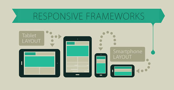
15 Fresh and Handy Frameworks For Responsive Web Design
In the world of web development, Responsive Web Design is the mainstream today. As a web developer, you should keep yourself updated with latest technology and trends. Only then, you can develop websites according to the latest market trends to provide your clients a great user experience.
In this post, we’ve gathered 15 new and useful responsive frameworks to help you create elegant responsive websites for all type of users, devices and browsers. All of these frameworks are great time savers and will keep you away from writing base CSS styles and JavaScript on your own.
So go through them and pick the ones you like!
# Furatto:

Furatto, developed in CSS meta-language Sass, is a highly customizable and powerful front-end framework that makes developers lives easier by enabling them to build rapid prototypes for their web applications. It is built on two most popular frameworks: Twitter Bootstrap and Foundation.
Like other frameworks, Furatto has taken care of all the essential basic elements for a web page – like Base, Forms, Grid, Table, Images and Buttons – and Components – such as Alert, Tag, Label, Pagination, Badge and NavBar. It exploits the popular flat UI trend and works well with latest mobile and desktop browsers.
#Ratchet:

Ratchet is a simple and lightweight framework that lets you prototype iPhone apps using CSS, HTML and JavaScript components. Just create a container div in your HTML, add some elements and you’re good to go. It is very similar to Twitter Bootstrap, with the only difference that it looks like the native iPhone interface.
Whether you’re a novice or high level developer, Ratchet is quite easy to use. It doesn’t need any special knowledge of iOS programming and requires only a small bit of JavaScript. It’s available in both uncompressed (for development) and minified (for production) versions.
#Typeplate:

Typeplate is an open-source typographic starter kit that is extremely useful for building beautiful, text-rich websites. It allows you to set solid base styles and add common typographic features (for instance dropping capitals and block quotes) built with proper markup and extensible styling.
Typeplate is built with Sass and based on OOCSS techniques. The best thing is that it is very lightweight (just 3kb when compressed) and you also have an option to cherry-pick your required elements and delete the rest. Typeplate also has a plain CSS version (11kb), but if you want to take benefit from all the heavy lifting, then you should use its Sass version (19kb).
# Girder:

Girder, built with Sass, is a minimalistic CSS grid to build and prototype modern websites. It creates flexible layouts separated into logical sections and makes use of Sass silent placeholders for structuring content in HTML. That way, it keeps your Markup free of meaningless classes like “grid4”, “unit_1of4”, “small-2”.
Girder is extremely useful for HTML prototypes, as its fast, small and quite easy to use. This simple yet versatile grid uses adjustable gutters, box-sizing and document flow. Though it is designed for building with Sass, but can also be used with plain CSS.
# PocketGrid:

PocketGrid is a smallest and powerful pure CSS responsive grid system that allows mobile-first, semantic, responsive, with an unlimited number of breakpoints and columns. It is really lightweight (0.5kB) and requires no CSS pre-processor. Also, it’s fully compatible with CSS frameworks like Zurb Foundation and Twitter Bootstrap, means you can use Foundation or Bootstrap components such as tabs, buttons etc.
PocketGrid provides you more flexibility than traditional grids by allowing you define blocks and block groups in your HTML. It’s based on content-first approach, means you can define custom breakpoints and swap columns to optimize the readability of your content.
# Responsive Web CSS:

Through Responsive Web CSS, you’ll be able to layout your pages within minutes for beautifully responsive on pages smart phones, tablets and desktops. It lets you build a responsive page in just three simple steps: Layout your page, Set views per device, Download your site layout.
First of all, you’ve to divide your page into different sections by adding divs. You can add, rename, remove and nest divs with a single mouse click until you’re satisfied. After that, you’re required to re-size each div according to how it should appear on each device. And then you can download the site skeleton and supporting CSS files, which arrange your pages according to a particular device by making use of media queries.
# Cascade:

Cascade is an open source front-end framework for building up high performance websites in no time. Very Similar to Foundation and Bootstrap, it consists of a number of HTML and CSS components, as well as optional JavaScript extensions. By implementing optimized atomic design, it gives you full control of the look & feel of your website and keeps the code bloat minimal.
Cascade, written in pure CSS, splits your CSS into separate files that is based on features, not on selectors. To balance footprint and flexibility in an optimal way, it implements a modifier design pattern that is inspired by OOCSS and SMACCS. You also don’t have to worry about browser quirks, as it can be used for all types of older and modern browsers.
# Markup:

The Markup Framework, built with pure HTML & CSS, is an open source collection of layouts, grids, forms, typography, and widgets that you can use as a base for your web projects in order to code rapidly. This framework is minimal, and there is proper separation of style, structure and semantics. With the latest CSS3 and HTML5 technologies, it progressively enhances your web pages. It has mobile-first responsive Grids and Layouts and print-optimized styles. As Markup uses no JavaScript, there’s no need to interpret the code in order to render output.
# .Fitgrid:

.Fitgrid is not a framework, but a solid foundation for advanced web designers that helps them build up an awesome responsive website. However it is designed to lets you create prototypes rapidly, but also works great in production environments. This grid system is made for those designers who want that their web pages shouldn’t look like “Bootstraped“.
This lightweight responsive grid is divided into 12 columns with percentile widths and all columns have 2% of margin on both sides. The grid is in total control of you and you’ll be able to save a lot of unnecessary code. Best of all, it works well in all latest browsers including IE7+.
# Clank:

Clank, inspired by Ratchet, is an open source HTML/CSS framework through which you can create prototypes of native phone/tablet applications. The code of Clank is written using modern CSS techniques. For a maintainable code-base, it utilizes the power of Sass and Compass. Like Twitter Bootstrap, it is component based framework, which lets you choose components as per your need and use them.
# Responsable:

Responsable is a clean responsive css/html/scss/less framework with a typographic baseline based on Semantic.gs, powered by LESS/SCSS. By using the power of SASS and LESS, it help developers create a perfect responsive framework. Instead using CSS reset, it normalizes elements for browser consistency.
Responsable allows you to customize column widths for easy grid nesting & customization. As all grid styles are employed in your CSS, it keeps your markup clean, nice and shiny. For adding responsitivity to your images, it uses the power of jQuery Picture. A baseline grid is incorporated into CSS normalize, which adds consistency to your typography.
# Kraken:

Kraken, powered by SASS, is a lightweight, style agnostic and mobile-first boilerplate designed specifically for front-end developers. It includes just the essentials: a CSS reset to make sure that your site is compatible with different browsers; a responsive, mobile-first grid; a well-designed, fluid typographic scale; CSS3 buttons; easily style links; basic form styling; optional add-ons to add more functionality to your site.
Kraken is an open-source web development framework that is designed to be modular and flexible with accessibility and performance in mind. As it takes advantage of the Object Oriented CSS approach for web development, classes can be easily matched, mixed and reused during the entire project.
# Topcoat:

Topcoat is a free, fully themeable CSS framework to help you create clean and fast web applications with ease. It is built to be perform faster than other frameworks. It features building blocks to help you get up and running in minutes. The architecture of this framework is based on BEM technology, which makes your applications less contextual, faster and easily manageable.
The best thing about this framework is that it’s power-packed with more than 100 icons, which are absolutely free and can be used as PNG, SVG or semantic icon font. Moreover, it lets you customize the theme according to your brand: just add colors and you’re good to go.
# Cardinal:

Cardinal is a small CSS framework that takes a “mobile-approach” device-agnostic approach to responsive web applications. It is designed specifically for those designers and developers who want to develop beautiful and well-organized responsive web applications without any hassle. It comes with a responsive grid system, fluid typography and useful default styles.
Cardinal provides a solid base to build responsive applications, as it starts with some handy default styles. To render HTML elements consistently, it uses normalize.css rather than a traditional CSS reset. Instead of maintaining a baseline grid, it leverages modular scale and unit-less line heights to re-size the layout and typography of your application across multiple devices.
# Centurion:

Centurion is an easy to use HTML5/CSS3 based web framework for creating responsive websites. No matter the device: iPhone, iPad, iPad mini, Mac, PC or Android tablet, it makes your project responsive and viewable on all devices. With its easy and scalable syntax, it is quite easy to get a new prototype faster. Since it is built using Sass, it allows you to customize the core files as per your requirements.