Responsive Web Design: Why Your Website Must Have It
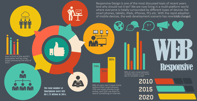
Responsive Design is one of the most discussed topics of recent years. And why should not it be? We are now living in a multi-platform world where everyone is totally surrounded by different types of devices like smart phones, tablets, iPads, iPhones, PCs etc. With the rapid adoption of mobile devices, the web development scenario has now totally changed.
Let’s take a look at following astonishing statistics:
According to a recent Google’s research study, 98% of users move between multiple devices in the same day to complete a task. Another research study shows how the mobile internet has changed our lives, stating that 80% of users don’t leave home without their smart phones, 74% use smart phones to go online, and 55% use them to search something on internet.
Smartphone sales have already overtaken PCs, and mobile internet usage is expected to surpass desktop usage before the end of 2014. Currently, more than half of all local searches carried out on mobile devices. If this trend continues, needless to say that mobile search will overtake desktop search in upcoming few years.
In addition to above facts, eMarketer, a research analyst company, has predicted that over a third of the world’s population will be using smart phones by the end of 2017. According to this report, mobile phone users are rapidly adopting smart phones due to declining prices and advances in 3G and 4G networks. In this report, it is also expected that the total number of Smartphone users will hit 1.75 billion in 2014. All these compelling evidences demonstrate that Responsive Design is the future of web development and online marketing.
Why You Should Adopt Responsive Design?
Now, having understood the importance of Responsive Web Design, let’s dive into some of its unique and major benefits:
#Google Loves It:
Nothing can beat this first and foremost reason. Google has publicly advocated the use of responsive web design, as it adheres perfectly to their high standards of high-quality content and a clean link structure.
Responsive web design uses a single URL and has the same HTML, which makes it easier for Google to crawl, index, and organize the content of a website. It uses only CSS to change how a web page will be rendered on a particular device. On the contrary, a separate mobile site runs on a different URL and has different HTML than its desktop version, which requires Google to crawl and index several versions of a site.
Additionally, Google recommends responsive web design because a single URL makes it easier for users to interact with, link to, and share your content that lives on your website. Also, users need no redirection to get the device-optimized view of your site, which reduces the web page load time. On the other hand, user agent-based redirection can degrade your website’s user experience.
#Enhanced User Experience:
One of the most appealing aspects of responsive design is its flexibility to adapt to any device and screen size. Rather than shrinking images and text to fit to the screen, a responsive website fits into the frame provided, giving your users a seamless and optimal experience. Best of all, a website with responsive design has an excellent navigation control through which users can easily access any kind of content without any scrolling or resizing, no matter where they are and which device they are using.
Furthermore, Google says if a user lands on the mobile version of your website and gets frustrated, there’s a 61% chance they will redirect to other website (most likely your competitor). Contrariwise, if their experience with your mobile site is positive, a user is 67% more likely to make a purchase or use a service. As user-experience is in place now as a ranking factor on Google, moving to responsive web design is quite beneficial for your business.
#Cost and Time Effective:
When responsive web design was not introduced, web developers used to create multiple versions of a single website for multiple devices. They were needed to put a lot of efforts to make an update to a web page, and also required to maintain a separate mobile domain for a site. For a mobile version, there was a need to have a separate mobile code base.
But after the evolution of responsive web design, web developers create a single website for all screen sizes, having a single version of the source code and only one CMS (Content Management System) to update a web page. Managing a single website requires less administration time and maintenance cost as compared to having two separate websites. Thus, responsive web design saves your both money and time.
#Improved SEO:
Another benefit of responsive web design is it makes your site search engine optimized. According to Pierre Farr, Google Webmaster Trends Analyst, responsive design is preferred over mobile templates by Google for better SEO. A responsive website has one single URL, which doesn’t only make it easier for search engine bots to crawl your site, but also reduces the chance of on-page SEO errors.
Also, to create multiple versions of a site results into duplicate content issue that Google strictly hates. With responsive web design, instead of optimizing content and building links for multiple sites, you just need to create a single responsive website and optimize content for a single URL. As link structure also remains same on each device, responsive design improves your rankings and visibility in search engines. For all these reasons, responsive sites typically get ranked higher than a separate mobile site in search engines.
#Increased Conversion and Sales:
As responsive websites have mobile specific features such as GPS route planning and click-to-call, as well as content is easily readable and looks great on every device, the conversion rate of your site gets increased dramatically. With responsive web design, your customers are able to access your website and make purchases by using various devices, which results into increased sales and higher conversion rate.
If a visitor faces a problem while landing on your site in his favorite device, then no doubt, you’re put your business down by losing a potential customer. A non-responsive website is not able to compete with your rival responsive websites; therefore, users are likely to switch to your competitor brand. In order to expand your business, you’ve to reach more people than your competitors. Because a general rule says, the larger audience you have, the higher will be the chances of improved conversion rate. A responsive design helps you expand your audience, which increases the chances of increased conversion from visitor to potential customer.
#Needs Only One SEO Campaign:
If you’ve a separate mobile version of your desktop site, then you’re required to run and manage two separate SEO campaigns for both. Whereas with responsive web design, there is no need to run two different SEO campaigns for your desktop and mobile site at the same time. Instead, you just require incorporating mobile-specific keywords into your responsive site, and running a single SEO campaign to promote it. This is the main benefit responsive design has over a separate mobile template.
#Great for Blogging and Social Activities:
IIf you’re a inbound marketer and have incorporated elements of social media and blogging in your marketing strategy, there is no doubt that your site has been getting a lot of traffic from mobile devices. A recent ComScore’s report cites that 55% of users log into social media sites on mobile devices. Needless to say, if you have a responsive site and sharing out content links, you’re not only going to experience high conversion rates and low bounce rates, but also a loyal audience.
#It will Adapt to Future Devices:
One of the hidden but most prominent benefits of responsive design is that it is 100% future-proof. While developing a responsive website, the size of the template is designed to adapt to screen-size, instead of device. This means your website will always render properly on whatever screen size it will be visited in future.
So, in the future, when new devices – such as watches, TVs, glasses etc. – will be introduced, your responsive website will continue to look amazing and beautiful. All you need to do is to simply update your content, instead of building a new website every year.