Create a responsive custom WordPress themes using Bootstrap in 5 simple steps

The most difficult task in creating a responsive custom WordPress theme or any responsive website in general is to code the CSS file of the theme. The CSS file dictates the main look of the theme and decides whether the theme is responsive or not. But what if you get a pre-coded responsive CSS sheet that is stuffed with all the main features? It will make your life a lot easier, won’t it? Keeping this in mind, we present to you few simple steps to integrate responsive Bootstrap framework in your WordPress theme. But first let’s talk about bootstrap.
What is Twitter Bootstrap Framework?

Boot strap is open source framework built in CSS and JavaScript and is based upon a language that is considered an extension of cascading sheet- LESS. The framework has a number of inbuilt tools that can be used in HTML, WordPress or any other CMS that accepts external CSS. Thus, it can be used to make any type of website. The framework contains a basic style definition of all the major features found in a website such as accordion, alerts, button drop-downs, button groups, carousel, dropdowns, labels, lists, modals, navbar, navigational tabs, page headers and hero unit, pills, progress bars, thumbnails, tool-tips, and typeaheads.
All these components can be easily used to create your responsive custom WordPress theme but requires in depth coding or some additional plugin as WordPress has no provision for including bootstrap components through dashboard itself.
Since it is written in JavaScript and CSS, it is easily understandable by a majority of web developers and used actively by designers, developers, professionals and amateurs alike. However, a thing to note here is that bootstrap doesn’t fully support all the features of HTML5 as it’s not built in CSS3. Though it is not that big a problem as most browsers don’t support the latest standards of HTML and CSS, so using Bootstrap automatically constricts you website to be mobile compatible.
To know more about the available components and usage of bootstrap refer to this guide.
A preview of features and components of bootstrap CSS, and how you can use these featuresn.
In addition if you want to know more about the JavaScript components and their usage in the Bootstrap framework refer to this link.
Step 1: Downloading Bootstrap
The first step in creating a custom responsive WordPress theme is to download the bootstrap framework. The default version of bootstrap can be downloaded from here. The best part about bootstrap is that you can customize the downloaded file according to specific needs. Thus we will advise you to always download the customized version from here. For this tutorial we don’t want to worry you about what to choose and what not, so just check on everything and download. The file size would be around 300-500 KB so it doesn’t matter anyway. Extract the bootstrap in a directory named bootstrap and place it inside the folder of the theme for which you wish to add the bootstrap. If you don’t know where the themes are located in WordPress, refer to this post.
Your Bootstrap folder will contain 3 folders named css, js, and img and just as the name suggests they contain CSS files, JavaScript files, and some related images. If you have downloaded the customized version of bootstrap from the link given above then you will have 2 files in the CSS folder named bootstrap.css and bootstrap.min.css but if you have downloaded from another source, make sure that the CSS folder contains bootstrap-responsive.css file as it would be necessary to create a responsive website.
Step 2: Declaring Bootstrap in Header
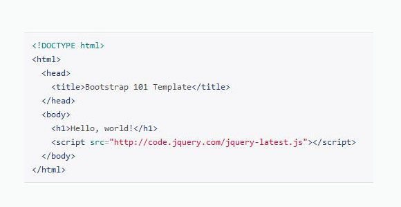
The first step after downloading Bootstrap is to declare it in the WordPress PHP file that contains your tags and doctype declarations. In most themes it is normally in header.php, but in some rare cases it is in index.php also. If you are creating your theme from scratch, it’s best to make a header.php.
The important point to note here is that even though bootstrap doesn’t support HTML5 to a 100%, it is still made in it, and thus your HTML doctype declaration should be accordingly. You can declare bootstrap in a header like this
<!DOCTYPE html>
<html>
  <head>
    <title>Responsive Bootstrap theme</title>
    <meta name="viewport" content="width=device-width, initial-scale=1.0">

    <!-- Bootstrap declaration-->
    <link href="bootstrap/css/bootstrap.min.css" rel="stylesheet" media="screen">

  </head>
This will include the bootstrap framework in HTML and PHP.
Note:- if you have downloaded the non customized version you have to include additional style sheet. So just add the following line to code just after <meta …..> tag
<link href="assets/css/bootstrap-responsive.css" rel="stylesheet" media = "screen">
Step 3: Bootstrap CSS import
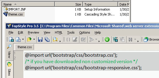
The next step is to import the CSS in your themes main style.css file. You can import the CSS like this
@import url('bootstrap/css/bootstrap.css');
/* if you have downloaded non customized version */
@import url('bootstrap/css/bootstrap-responsive.css');
This code should be just after the theme information comment of the style.css sheet before any other code. You can add any CSS code and styling you want after importing, but make sure that it doesn’t override the CSS components already present in the bootstrap.css, unless of course, you specifically want to do that. There are lots of possibilities in CSS and HTML.
Step 4: Fluid and fixed Layouts
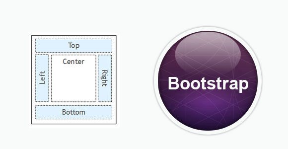
The bootstrap framework utilizes 12 column 940px grid that can adapt to 724px and 1170px wide depending on the viewport when responsive is enabled. Each column can be accessed using .span* class where ‘*’ represent the appropriate number of columns that the div will extend to such as
<div class="row">
        <div class="span4">
          <h2>Heading</h2>
          <p>Lorem Ipsem </p>
          <p><a class="btn" href="#">View details</a></p>
        </div>
</div>
<div class="row">
        <div class="span8">
          <h2>Heading2</h2>
          <p>Lorem Ipsem 2 </p>
	<div class="row">
     	 	<div class="span6">Level 2</div>
      		<div class="span2">Level 2</div>
   	 </div>
          <p><a class="btn" href="#">View details 2</a></p>
        </div>
</div>
This code will create a block that will span 4 columns in the given row and another block that will span 8 columns in the next row. The <a class=”btn” href=”#”> tag will include a button at the end of the content block. If you have noticed, I have included another row inside the 8 span row. This is the way by which you can nest one column inside another. See how I have explained nested columns, buttons, and gird in a single code example.
The framework comes with two inbuilt types of grid layout, Fluid and Fixed. You can use any of the two by changing <div class = “row”>in the above example to <div class=”row-fluid”>for fluid layout and to <div class=”container”> for fixed layout. For example
<div class="row-fluid"> /* instead of class= row*/
        <div class="span4">
          <h2>Heading</h2>
          <p>Lorem Ipsem </p>
          <p><a class="btn" href="#">View details</a></p>
        </div>
</div>
<div class="row-fluid">
        <div class="span8">
          <h2>Heading2</h2>
          <p>Lorem Ipsem 2 </p>
	<div class="row-fluid">
     	 	<div class="span6">Level 2</div>
      		<div class="span2">Level 2</div>
   	 </div>
          <p><a class="btn" href="#">View details 2</a></p>
        </div>
</div>
Similarly, you can create a 2 column fluid grid using a <div class = “container-fluid”> tag. This is great for creating pages that have two different columns such as a side bar and content page. Though for WordPress you can add a sidebar without using it but still it’s one of the capabilities of bootstrap.
<div class="container-fluid">
  <div class="row-fluid">
    <div class="span3">
      <!—This will create a side bar-->
      <!—after you add content obviously>
    </div>
    <div class="span7”>
      <!—The body content Body content-->
    </div>
  </div>
</div>
Note:- One special mention to the class list would be the <div class=”hero-unit”> tag. I really love using it and will urge you to try and experiment with the tag.
Step 5: Responsive classes and cool tricks

Till now we have only talked about layouts and grids. But the main beauty of bootstrap comes in responsive design and responsive tags. The bootstrap frame work gives a variety of classes that can be used for creating a responsive layout. The most used out of them is .min-width and.max-width classes. But other classes worth mentioning include
- .visible-phone: – This class will make a component visible only when the screen size is below the standard tablet and desktop screen size. The bootstrap framework takes the standard screen size of tablets as between 979px to 768px, and anything greater than that to be desktops, and less than that to be mobile devices.
- .visible-tablet: – This class, just like the previous class, will only make the component visible to tablets.
- .visible-desktop: – this class will make the component visible to desktops
- .hidden-phone:- this class will hide specific components in the mobile view
- .hidden-tablet:- this class will hide specific components in the tablet view
- .hidden-desktop:- this class will hide specific components in the desktop view
IN addition you can use the following media queries in the CSS file to render specific style according to screen size.
@media (min-width: 1200px)
{
/* Style specific to large desktops */
}

@media (min-width: 768px) and (max-width: 979px)
{
/* Style specific to desktops and landscape rendering in tablets*/
}

@media (max-width: 767px)
{
/* Style specific to portrait rendering in tablets */
}

@media (max-width: 480px)
{
/* Style specific to rendering in phones */
Conclusion

As said earlier, bootstrap comes loaded with many features and thus requires a good knowledge about bootstrap, HTML, and CSS to properly harness its power. It only saves you the time to manually create all the components from scratch. However if you are new to programming it is highly advisable to get your themes made by expert WordPress developers.


