Google’s Mobile-Friendly Update: How Safe Is Your WordPress Site?
Google recently announced a “major” update to its search algorithm, called mobile-friendly, to help users easily discover high quality, device-optimized and most relevant search results possible. The search engine giant confirmed that the “mobile-friendliness” of a website would be considered as a crucial ranking factor after April 21st.
Just like Panda and Penguin, this interesting algorithm update would have a significant impact on mobile search results worldwide. Needless to say, if your WordPress site doesn’t have a mobile-friendly design, it’ll likely either to appear lower in mobile search results or even to get penalized by Google for poor performance on mobile devices. After reading this post, you’ll get answer to these questions:
- What’s Mobile-Friendly Algorithm All About?
- How to Know If Your WordPress Site Mobile-Friendly?
- If Not, How Can You Make It Mobile Ready?
- Why Is Responsive Web Design The Best Choice?
Let’s start!
What’s Mobile-Friendly Algorithm All About?
Since the use of mobile devices to access the internet is rapidly growing day by day, Google decided to make an update to its search algorithm so that users could have best searching experience possible on mobile devices. This is not the first time when Google has rolled out an algorithm update to improve the mobile web. In the past, it has made a few minor updates to improve the search experience for Smartphone users and ensure a site is viewable on modern devices. But this update seems to have a greater impact on search results than past major algorithm changes, including Panda and Penguin, says Zineb Ait Bahajji, Webmaster Trends Analyst at Google. In a nutshell, being mobile-friendly is no longer just an option but a critical necessity.
The main purpose of this algorithm update is to deliver users the most relevant and timely search results on mobile devices, by giving mobile-ready sites a boost and demoting mobile-unfriendly ones in search engine results. Realizing that users feel tired of browsing non-mobile optimized websites, Google has tried to encourage the use of mobile-friendly design with this update.
The mobile-friendly algorithm update applies on a page-by-page basis: the mobile-friendliness of each page on your site will be judged separately. Means, if some pages of your site are not mobile-ready, they will not affect the ranking of your whole site in mobile searches. That’s the good side of this update.
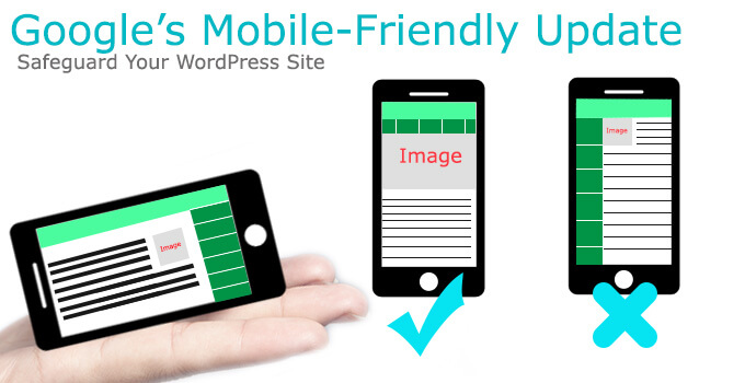
According to Google, a web page is mobile-friendly if it:
- Doesn’t use Flash.
- Uses text that mobile users can easily read without zooming in.
- Sizes content to the mobile screen to prevent users from zooming and scrolling horizontally.
- Incorporates buttons and links that are not too close, but are big enough to be easily clicked.
So if your site doesn’t meet any of the above guidelines, it could be a red flag for your site’s ranking on mobile devices.
So, Is Your WordPress Site Mobile-Friendly?
Unlike previous algorithm updates, this time Google has made it quite easy for site owners to know whether or not their site is mobile-friendly. You can check the mobile-friendliness of your site three ways:
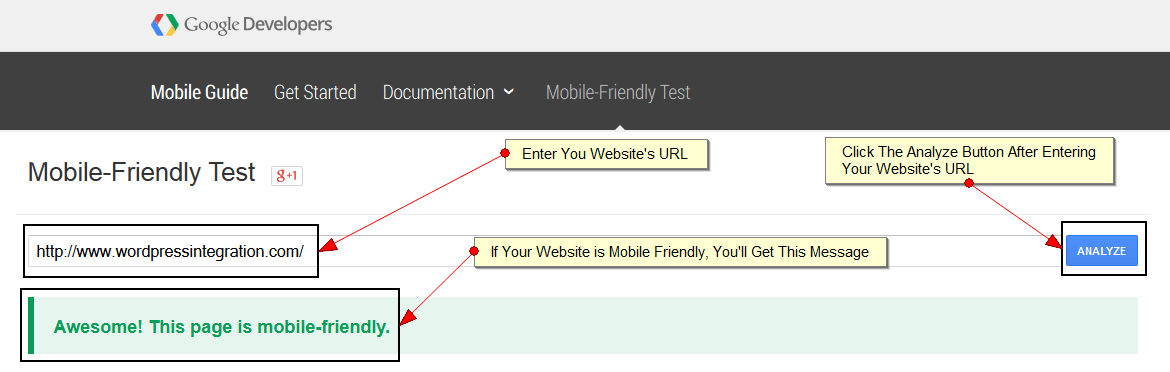
- Taking the Mobile-Friendly Test:
To help you check if a web page is ready for mobile devices, Google has introduced a new mobile-friendly testing tool. This tool analyzes entered URL and reports back if the page is mobile-friendly. Also via a screenshot, it gives you an idea of how the page will appear to the Googlebot. This tool is perfect to use only if you have a few web pages to test.
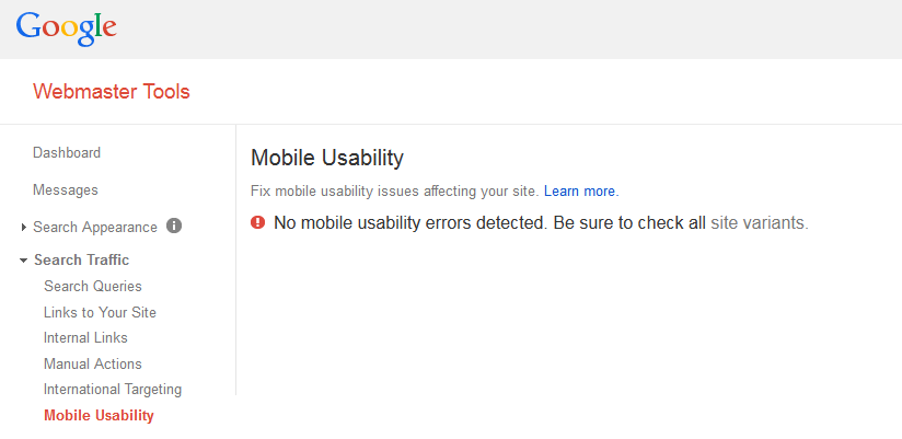
- Through Your Webmaster Tools Account:
Using this method, you can get a complete list of issues related to mobile usability across your site. Just login to your Webmaster Tools Account, move to Search Traffic –>> Mobile Usability and you’ll get the whole picture of your site’s mobile-friendliness. There you’ll find all the pages that are not able to pass the mobile-friendly test, along with the issues they have and tips on how to fix them.
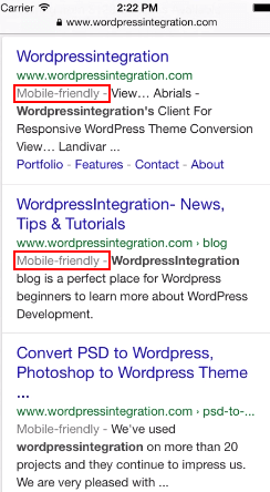
- Using a Mobile Browser:
This is the simplest way to check whether your site is mobile-friendly or not. Open up the browser on a mobile device, go to Google.com and enter your website’s URL in the search box. If your site is friendly to mobile devices, you’ll see a notation in the search results next to your site. If it’s not listed as mobile-friendly, you need to get to work ASAP.
To be on the safe side, we recommend you to run all these three tests on your site.
If Not, How Can You Make It Mobile Ready?
In case your site fails the mobile-friendly test, don’t panic. Below we have mentioned three different configurations using any of which you can make your site optimized for mobile devices:
- Responsive Design: Responsive design is Google’s favorite design pattern because it serves the same HTML code on the same web address regardless of what device – mobile, tablet, desktop, non-visual browser – a user is using. If your site is responsive, it will adapt as viewers move from desktop to tablet to mobile and beyond.
- Dynamic Serving: Like responsive design, this approach uses the same URL regardless of viewer’s device, but dynamically serves a different HTML (and CSS) to different devices, depending on the user-agent detected by the server.
- Separate URLs: This configuration serves different code to each device while having separate URLs for different devices. For example, when a user tries to access www.example.com on a mobile device, he will be redirected to its mobile version m.example.com for mobile-optimized view.
Responsive Web Design: Why Is It The Best Choice?
Keeping the same HTML code and a single URL for all devices, responsive design is the best mobile configuration among all the three above. Below are some solid reasons why you should adopt responsive design:
- Users have a single URL to share and link to your content.
- Less engineering time required: there is no need to maintain multiple pages for the same content.
- Reduced load time: No redirection required to give users a device-optimized view.
- As a responsive site has a single version of the content, a single Googlebot user agent is required to crawl your web pages once. Saving resources while crawling, responsive design improves the crawling efficiency of Googlebot to index your site’s content in a better way.
- Responsive design helps you avoid common mistakes that you often made while building mobile sites.
Published By: WordPressIntegration Team – Place your order now for our responsive WordPress theme development service.