The DIY Guide to Converting PSD to WordPress Using Bootstrap: 7 Easy Steps
Initially started as a simple blogging platform, WordPress has evolved into a fully-fledged CMS over the years. Powering over 33% of all websites, this amazingly popular PHP based CMS today is used by a wide variety of websites, ranging from high-traffic personal blogs to renowned eCommerce stores. According to recent statistics, over 50,000+ new WordPress sites are launched every day, which demonstrates the tremendous popularity and usage of the CMS.
What makes WordPress so popular is its ease-of-use, flexibility, and the abundance of themes and plug-ins. Where the sheer number of themes allows you to change the entire look of your site with just a few clicks, on the other hand, the availability of over 55k plugins lets you extend the functionality of your site without having to dig into its source code.
However, if you want to make your website stand out from the crowd of hundreds of thousands of other sites, you need a Custom Responsive WordPress Theme that is built specifically for your website. And, without a shadow of a doubt, PSD to Responsive WordPress Theme Conversion is one of the best techniques to create a custom responsive website for your business.
For those who are not familiar with the term “PSD to Responsive WordPress Conversion”, it refers to the process of converting a PSD file to a fully-functional WordPress theme using cutting-edge web technologies such as HTML5, CSS3, JavaScript, and PHP.
Through this comprehensive tutorial, we’ll learn how to convert a PSD file into a fully-responsive WordPress theme using Bootstrap, but before we start, let’s get familiar with some basic terms involved in the PSD to Responsive WordPress Theme Conversion process:
HIGHLIGHTS
7 Easy Steps to Convert PSD to Responsive WordPress Theme (Bootstrap)
- What is PSD?
- What is WordPress Theme?
- What is Responsive Web Design?
- Step 1: Analyze the PSD
- Step 2: Slice the PSD
- Step 3: Download and Unzip Bootstrap
- Step 4: Write HTML5, CSS3 & JavaScript
- Step 5: Break Down HTML File Into WordPress Theme File Structure
- Step 6: Integrate WordPress Inbuilt Tags & Functions
- Step 7: Final Testing
- The Bottom Line
PSD
PSD, which stands for Photoshop Document, is the default file format that Adobe Photoshop uses to save workable files. Most of the professional designers choose Photoshop to create custom designs because it is undoubtedly the best and the most popular graphic design tool available in the market today.
WordPress Theme
In WordPress, a theme is essentially a collection of templates and stylesheets put together to define the look and feel of a WordPress-powered website. Think of it like your smartphone theme that defines the look and feel of your phone. Likewise, a WordPress theme provides the basic visual identity to your website or blog.
Responsive Web Design
Responsive Web Design, sometimes abbreviated as RWD, is a technique that use HTML5 and CSS3 Media Queries to automatically adjust a web page to make it look good on a variety of devices and screen sizes, including desktops, laptops, tablets, and smartphones.
Since Responsive Web Design is Google’s recommended design pattern, you need to make sure your WordPress site is fully-responsive and renders perfectly across all devices and screen sizes. To help you learn everything about Responsive Web Design and all related coding, here are some great resources that you can use to level up your knowledge about RWD:
- Responsive Web Design Basics: A great resource by Google for Responsive Web Design beginners.
- Basic Principles of Responsive Web Design – An informative blog post by Sandijs Ruluks, showing the difference between Responsive Web Design and Adaptive Web Design.
- Responsive Web Design Resources – A collection of 44 best Responsive Web Design Resources by UserTesting Blog.
- Responsive Web Design – A historically significant blog post by Ethan Marcotte to learn about Responsive Web Design.
- Responsive Images – An extremely useful blog post by Matt Marquis to learn about responsive images.
- Fluid Grids – A great blog post by Ethan Marcotte to learn about fluid grids and how to use them.
- Responsive Resources – A comprehensive collection of resources about the various aspects of Responsive Web Design.
As a matter of fact, creating a fully responsive WordPress theme requires you to have a good grip over CSS3 media queries. However, if you are unwilling to dive into the same, you can try using a responsive front-end framework that comes packed with a pre-coded responsive stylesheet. Some of the most popular and widely used front-end frameworks are:
- Bootstrap: A fairly easy to learn and use responsive front-end framework by Twitter, which uses a CDN to maintain the load speed of your website.
- Foundation: The second most popular and highly customizable responsive front-end grid framework by ZURB with absolutely tiny file size.
- Semantic UI: A relatively new responsive front-end framework that utilizes natural language principles to make the website’s code more readable and understandable.
Out of the numerous responsive front-end frameworks available in the market today, Bootstrap is considered the best and most ideal framework for Responsive Web Design due to its exceptionally powerful grid system, endless customization possibilities, and a myriad of other outstanding features which it offers to developers. This is also one of the main reasons why we chose Bootstrap for this tutorial.
So, without further ado, now let’s get into the process of converting a PSD template into a well-functional, fully-responsive WordPress theme using Bootstrap!
Step 1: Analyze the PSD
If you have designed your custom responsive website yourself, you can skip to step number two. However, if you’re a developer who got his website designed from a professional designer and is planning to convert it into a highly responsive WordPress theme, it is recommended you do a thorough analysis of your website design.
Analyzing your PSD meticulously will not only help you comprehend all the complications you may face during the conversion process but also will give you a quick overview of how you should kick off and finish your PSD to Responsive WordPress Conversion project. Altogether, you should be very clear about all the steps you’re going to perform, such as splitting mockup into HTML, writing CSS codes, inserting images, etc.
Step 2: Slice the PSD
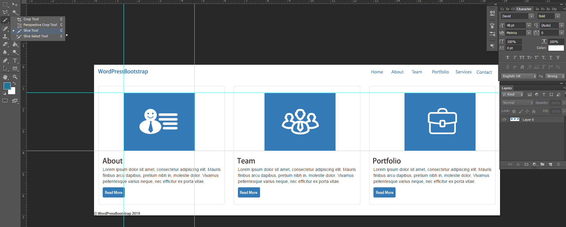
Once you’ve carefully analyzed your PSD, the next step is to slice images from the PSD. If you’re wondering what the term “slicing” means, it simply refers to cutting and dividing a single image file into multiple individual image files each having the different design elements of the overall design. This step is important because it is nearly impossible to code the whole design from a single image. Means, to code a web page, you first need to slice your PSD into separate image files and then weave them together logically.
To do this, you simply need to open your design file in Photoshop and find out the images that need slicing. Look for these components first to make the slicing process easier:
- Backgrounds and Other Visual Elements
- Header and Separator
- Footers and Others
Thus, utilizing the built-in facility to slice images in Photoshop, you can cut and save pixel perfect images either in JPEG or PNG (if you require transparency) format. Read how to slice images here and watch the YouTube video given below to learn the basics of PSD Slicing.
https://www.youtube.com/watch?v=XgxEieLbloc
While slicing your PSD, you have to be extremely careful about what needs to be static and what can be created dynamically. There are a number of elements, like buttons, solid color backgrounds, gradient backgrounds, header and footer color, lines, rows, and special symbols, which can be created just by writing a few lines of CSS code.
So, you don’t need to cut and save these elements as images. Instead, only cut elements that cannot be created dynamically, like logo and background images. Remember, the lesser the number of images your website has, the faster it will load.
Step 3: Download and Unzip Bootstrap
Once you have done with the slicing, it’s time to set up Bootstrap. Simply go to https://getbootstrap.com/ and download the latest version of the framework from there. After the download is completed, extract the zip file to a folder. Now if you open the extracted folder, you’ll find two folders, named css, and js inside it.
Step 4: Write HTML5, CSS3 & JavaScript
The next step is to code the sliced elements into an HTML5 webpage and style it using the CSS3 to make it look exactly like PSD. This requires you to have a deep knowledge of HTML5 and CSS3.
If you don’t know anything about these scripting languages, don’t worry! Following are some of the best online resources where you can learn everything about HTML5 and CSS3:
HTML5 Resources:
- W3Schools: The number one website for learning the basics of HTML.
- TutorialsPoint: Another great site for aspiring web developers to learn HTML in detail with practical examples.
- HTML Dog: An in-depth tutorial for those who have absolutely no previous knowledge of HTML and CSS.
- HTML.net: A series of 15 highly-informative tutorials to help you easily get started with HTML coding.
- HTML Coding Standards: Best practices by WordPress to write clean, well-commented HTML code.
- Mozilla Developer’s Section: A dedicated section by Mozilla to help developers learn a lot about HTML5 through a variety of tutorials.
- Web Design Tuts: This website offers a bunch of free and paid tutorials to make you an expert in HTML5 language.
- W3: A great place to find in-depth information about HTML5 along with all of its latest developments.
- W3 Validator: An amazing tool to check if your HTML5 code meets the W3 open web standards.
CSS3 Resources:
- W3Schools CSS: One of the most popular resources for CSS3 tutorials and examples, with each tutorial having a ‘try it yourself’ page.
- Learn CSS3: An excellent resource by Mozilla to make you well-familiar with every aspect of CSS3.
- CSS Tutorial: A great website to learn CSS step by step.
- CSS Web Design Tuts: A whole cornucopia of free and paid tutorials that can teach you a lot about CSS3.
- W3 CSS: A great place to get the latest news and technical information about CSS3.
- CSS Basics: As the name explains itself, this website is a great place to learn all the basics of CSS3.
- CSS Coding Standards: Best practices by WordPress to write meaningful and readable CSS code.
- CSS Validator: A fantastic tool to check if your CSS3 code meets all the web standards set by W3!
Although many of the functions today can be implemented through CSS3 Animations, there might be times when you need to write some JavaScript code to add specific functionality to your WordPress site. For those scenarios, below are some valuable resources to help you learn or refresh your memory about JavaScript:
JavaScript Resources:
- W3Schools JS: If you’re new to JavaScript, this is definitely a great place to start with.
- jQuery: The most popular JavaScript library every developer aspires to learn.
- Learn JS: A great collection of interactive JavaScript tutorials to help you better understand and quickly learn the programming language.
- MDN JavaScript: Published by Mozilla, this site offers tutorials and lessons as well as a glossary of JavaScript functions.
- JavaScript for Cats: An amazing place for new programmers to learn JavaScript basics.
- JavaScript Coding Standards: Best practices by WordPress to format and style JavaScript code in the best possible manner.
Now let’s come to the main point of this step, which is to write HTML5, CSS3 & JavaScript code for your sliced elements. For this, you need to create a new folder inside which you need to create:
- An HTML file named index.html.
- A CSS file named style.css.
- A subfolder named images or img (or whichever you like) to keep the images.
- Another folder called JavaScript or JS to store all of the JavaScript and jQuery files.
Since you want to code your theme using Bootstrap, you’ll have to initialize the framework in the head section and place the associated JavaScript in the body section of your index.html file as follows:
<!DOCTYPE html>
<html lang=”en”>
<head>
<meta charset=”utf-8″>
<meta name=”viewport” content=”width=device-width, initial-scale=1.0″>
<link href=”css/bootstrap.min.css” rel=”stylesheet” media=”screen”>
</head>
<body>
<script src=”https://ajax.googleapis.com/ajax/libs/jquery/3.4.0/jquery.min.js”></script>
<script src=”js/bootstrap.min.js”></script>
</body>
</html>
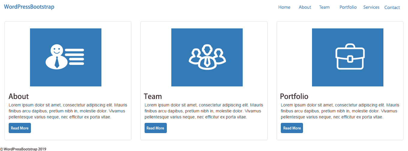
Now you can take advantage of Bootstrap Components in your HTML template. For instance, here we’re creating a simple web page having a navigation menu and thumbnail components:
<!DOCTYPE html>
<html lang=”en”>
<head>
<meta charset=”utf-8″>
<meta name=”viewport” content=”width=device-width, initial-scale=1.0″>
<link href=”css/bootstrap.min.css” rel=”stylesheet” media=”screen”>
</head>
<body>
<div class=”container-fluid”>
<div class=”navbar”>
<a class=”navbar-brand” href=”#”>WordPressBootstrap</a>
<ul class=”nav navbar-nav pull-right”>
<li><a href=”#”>Home</a></li>
<li><a href=”#”>About</a></li>
<li><a href=”#”>Team</a></li>
<li><a href=”#”>Portfolio</a></li>
<li><a href=”#”>Services</a></li>
<li><a href=”#”>Contact</a></li>
</ul>
</div>
</div>
<div class=”row”>
<div class=”col-sm-6 col-md-4″>
<div class=”thumbnail”>
<img src=”image1.png”>
<div class=”caption”>
<h3>About</h3>
<p>…</p>
<p><a href=”#” class=”btn btn-primary” role=”button”>Read More</a></p>
</div>
</div>
</div>
<div class=”col-sm-6 col-md-4″>
<div class=”thumbnail”>
<img src=”image2.png”>
<div class=”caption”>
<h3>Team</h3>
<p>…</p>
<p><a href=”#” class=”btn btn-primary” role=”button”>Read More</a></p>
</div>
</div>
</div>
<div class=”col-sm-6 col-md-4″>
<div class=”thumbnail”>
<img src=”image3.png”>
<div class=”caption”>
<h3>Portfolio</h3>
<p>…</p>
<p><a href=”#” class=”btn btn-primary” role=”button”>Read More</a></p>
</div>
</div>
</div>
<hr>
<footer>
<p>© WordPressBootstrap 2019</p>
</footer>
</div>
<script src=”https://ajax.googleapis.com/ajax/libs/jquery/3.4.0/jquery.min.js”></script>
<script src=”js/bootstrap.min.js”></script>
</body>
</html>
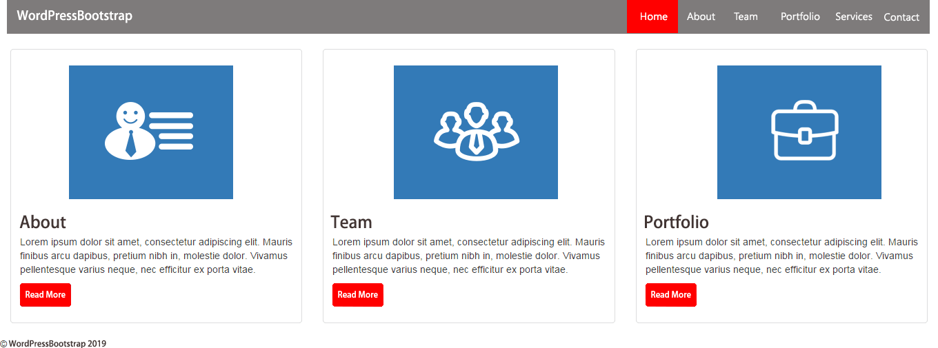
Now if you open this web page in your browser, it should look something like this:
As you can see, currently there is no custom CSS applied to this page. To style the contents of our HTML page, we have added the following code to our style.css file:
.navbar {
background:#7E7B7B;
margin-bottom:0px;
border-radius:0px;
}
.navbar-brand {
color:#FFFFFF;
line-height: 50px;
padding-left: 10px;
}
a.navbar-brand:hover {
color:#FF0000;
}
.navbar ul {
padding-right:4%;
}
.navbar ul li a {
color:#FFFFFF;
margin-right:10%;
}
.navbar ul li a:hover {
color:#FFFFFF;
background-color: #FF0000;
}
a.btn-primary{
background-color: #FF0000;
color:#FFFFFF;
}
To make the newly created style.css file work, you need to include it in the HTML page. So, just above the line where you cited bootstrap.min.css in the index.html file, include a reference link to the style.css file as follows:
<head>
<link href=”css/style.css” rel=”stylesheet” media=”screen”>
<link href=”css/bootstrap.min.css” rel=”stylesheet” media=”screen”>
</head>
<body>
…
…
</body>
Now open your index.html file in your browser again and you’ll see the difference – custom CSS has been applied to the page.
This was just a simple example! In the same manner, utilizing the Bootstrap, you can code and assemble all the sliced images into a well functional HTML page. At the end of this step, there will be two files in your hands: index.html and style.css.
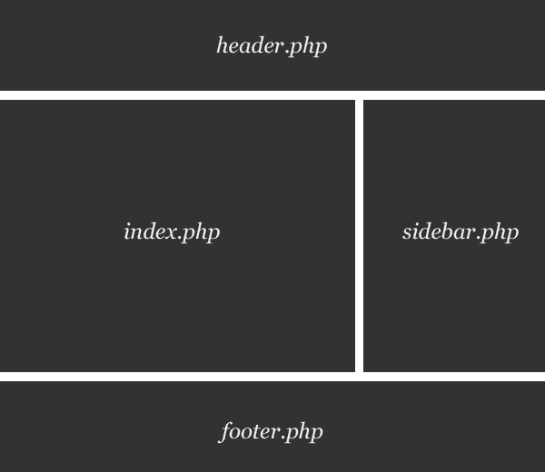
Step 5: Break Down HTML File Into WordPress Theme File Structure
Now that you have successfully converted your Photoshop design file into HTML5 and CSS3, it’s time to carry out the main conversion: turning your static HTML file (index.html) into a fully responsive, dynamic WordPress theme. For this, you would need to break your index.html down into multiple PHP files according to the WordPress theme’s file structure.
In other words, you would need to distribute the code of your index.html file into multiple PHP files that WordPress calls together to produce a webpage. Ideally, a typical WordPress theme comprises of several PHP files such as:
- archive.php
- category.php
- comments.php
- comments-popup.php
- footer.php
- header.php
- index.php
- page.php
- search.php
- sidebar.php
- single.php
- style.css
- 404.php
- functions.php
However, you only require index.php and style.css files to make a WordPress theme functional. For our example, we’re breaking our index.html file into three files: header.php, index.php, and footer.php.
Let’s start with the header.php file. In your WordPress installation, under /wp-content/themes/, create a folder having the same name as the name of your brand new theme. Thereafter, create files named header.php, index.php, and footer.php in this theme folder. Now copy the entire HTML code from the top of the index.html page and past it into the header.php file as follows:
<!DOCTYPE html>
<html lang=”en”>
<head>
<meta charset=”utf-8″>
<meta name=”viewport” content=”width=device-width, initial-scale=1.0″>
<link href=”css/style.css” rel=”stylesheet” media=”screen”>
<link href=”css/bootstrap.min.css” rel=”stylesheet” media=”screen”>
</head>
<body>
<div class=”container-fluid”>
<div class=”navbar”>
<a class=”navbar-brand” href=”#”>WordPressBootstrap</a>
<ul class=”nav navbar-nav pull-right”>
<li><a href=”#”>Home</a></li>
<li><a href=”#”>About</a></li>
<li><a href=”#”>Team</a></li>
<li><a href=”#”>Portfolio</a></li>
<li><a href=”#”>Services</a></li>
<li><a href=”#”>Contact</a></li>
</ul>
</div>
</div>
Likewise, paste the middle part of the index.html file into the index.php file:
<div class=”row”>
<div class=”col-sm-6 col-md-4″>
<div class=”thumbnail”>
<img src=”image1.png”>
<div class=”caption”>
<h3>About</h3>
<p>…</p>
<p><a href=”#” class=”btn btn-primary” role=”button”>Read More</a></p>
</div>
</div>
</div>
<div class=”col-sm-6 col-md-4″>
<div class=”thumbnail”>
<img src=”image2.png”>
<div class=”caption”>
<h3>Team</h3>
<p>…</p>
<p><a href=”#” class=”btn btn-primary” role=”button”>Read More</a></p>
</div>
</div>
</div>
<div class=”col-sm-6 col-md-4″>
<div class=”thumbnail”>
<img src=”image3.png”>
<div class=”caption”>
<h3>Portfolio</h3>
<p>…</p>
<p><a href=”#” class=”btn btn-primary” role=”button”>Read More</a></p>
</div>
</div>
</div>
Finally, paste the latter part of the index.html file into the footer.php file:
<hr>
<footer>
<p>© WordPressBootstrap 2019</p>
</footer>
</div>
<script src=”https://ajax.googleapis.com/ajax/libs/jquery/3.4.0/jquery.min.js”></script>
<script src=”js/bootstrap.min.js”></script>
</body>
</html>
Thus, this step includes breaking up the index.html file into various PHP files according to the theme structure of WordPress. Now let’s move on to the next step of the tutorial!
Step 6: Integrate WordPress Inbuilt Tags & Functions
One of the best things about WordPress is that it offers a myriad of inbuilt tags and functions that can be used to add the desired functionality to a WordPress theme. Just use the right combination of built-in WordPress tags and functions and the CMS will take care of everything. Surprisingly, this is also one of the main reasons why many people opt for PSD to Responsive WordPress Theme Conversion.
In the previous step, we’ve broken up our index.html file into various PHP files and now, it’s time to first add WordPress PHP tags to these files and then amalgamate them together to create a highly-functional WordPress theme. For this, you need to be well-versed with the PHP language. If you’re not, use the following resources to learn PHP:
- W3Schools PHP: One of the best and most popular resources for beginners to learn PHP.
- PHP Manual: Here you’ll find everything you need to achieve immense expertise in PHP.
- PHP 101: Another great website for absolute beginners to learn PHP.
- TutorialsPoint: A great place to learn PHP in detail with practical examples.
- PHP Coding Standards: Best practices by WordPress clean, easy to read PHP code.
For our example, we have added the function to header.php in order to display the site title in form of a link:
<a href=”<?php bloginfo(‘url’); ?>” title=”<?php bloginfo(‘name’); ?>” class=”navbar-brand”><?php bloginfo(‘name’); ?></a>
And for menu, we have used the function as follows:
<?php wp_nav_menu( array(‘menu’ => ‘Project Nav’, ‘menu_class’,’nav navbar-nav pull-right’ )); ?>
Consequently, our header.php file now looks like this:
<?php?>
<!DOCTYPE html>
<html <?php language_attributes(); ?> class=”no-js”>
<head>
<meta charset=”<?php bloginfo( ‘charset’ ); ?>”>
<meta name=”viewport” content=”width=device-width, initial-scale=1″>
<?php wp_head(); ?>
</head>
<body <?php body_class(); ?>>
<div class=”container-fluid”>
<div class=”navbar”>
<a href=”<?php bloginfo(‘url’); ?>” title=”<?php bloginfo(‘name’); ?>” class=”navbar-brand”><?php bloginfo(‘name’); ?></a>
<?php wp_nav_menu( array(‘menu’ => ‘Project Nav’, ‘menu_class’,’nav navbar-nav pull-right’ )); ?>
</div>
The code of the footer.php will remain the same except the addition of the function.
<?php?>
<footer>
<p>© WordPressBootstrap 2019</p>
</footer>
</div>
<?php wp_footer(); ?>
</body>
</html>
Now come to the index.php file. Here we have used function to show thumbnail components.
<?php
get_header(); ?>
<div class=”row”>
<?php dynamic_sidebar(‘sidebar-1’); ?>
<?php dynamic_sidebar(‘sidebar-2’); ?>
<?php dynamic_sidebar(‘sidebar-3’); ?>
<hr>
<?php get_footer(); ?>
Moreover, to ensure the proper rendering of our thumbnail components, we have to define sidebar-1, sidebar-2, and sidebar-3 in the functions.php file as follows:
function wordpressbootstrap_widgets_init() {
register_sidebar( array(
‘name’ => __( ‘Widget Area’, ‘wordpressbootstrap’ ),
‘id’ => ‘sidebar-1’,
‘description’ => __( ‘Add widgets here to appear in your sidebar.’, ‘wordpressbootstrap’ ),
‘before_widget’ => ‘<aside id=”%1$s” class=”widget %2$s”>’,
‘after_widget’ => ‘</aside>’,
‘before_title’ => ‘<h2 class=”widget-title”>’,
‘after_title’ => ‘</h2>’,
)
register_sidebar( array(
‘name’ => __( ‘Widget Area’, ‘wordpressbootstrap’ ),
‘id’ => ‘sidebar-2’,
‘description’ => __( ‘Add widgets here to appear in your sidebar.’, ‘wordpressbootstrap’ ),
‘before_widget’ => ‘<aside id=”%1$s” class=”widget %2$s”>’,
‘after_widget’ => ‘</aside>’,
‘before_title’ => ‘<h2 class=”widget-title”>’,
‘after_title’ => ‘</h2>’,
)
register_sidebar( array(
‘name’ => __( ‘Widget Area’, ‘wordpressbootstrap’ ),
‘id’ => ‘sidebar-3’,
‘description’ => __( ‘Add widgets here to appear in your sidebar.’, ‘wordpressbootstrap ),
‘before_widget’ => ‘<aside id=”%1$s” class=”widget %2$s”>’,
‘after_widget’ => ‘</aside>’,
‘before_title’ => ‘<h2 class=”widget-title”>’,
‘after_title’ => ‘</h2>’,
)
);
}
add_action( ‘widgets_init’, ‘wordpressbootstrap_widgets_init’ );
The above code will register three widget areas in the WordPress dashboard, where we need to put the respective “HTML code” for each thumbnail component. For instance, we have put the following code in sidebar-1 widget.
<div class=”col-sm-6 col-md-4″>
<div class=”thumbnail”>
<img src=”image1.png”>
<div class=”caption”>
<h3>About</h3>
<p>…</p>
<p><a href=”#” class=”btn btn-primary” role=”button”>Read More</a></p>
</div>
</div>
</div>
And so on…
Finally, we need to load our stylesheets, which can be done by calling wp enqueue style () function in the function.php file:
// Load the main stylesheet
wp_enqueue_style( ‘wordpressbootstrap-style’, get_stylesheet_uri() );
// Load Bootstrap stylesheet
wp_enqueue_style( ‘wordpressbootstrap’, get_template_directory_uri() . ‘/css/bootstrap.min.css’);
For the complete list of all the tags, functions, and other facilities available in WordPress, we recommend you go through the links given below:
- Template Tags: Find a complete list of WordPress tags on this official Codex page. Every tag has a dedicated page where that tag is explained in detail.
- Function Reference: Another official Codex page which is a reference guide to all the PHP functions used in WordPress. Just like Template Tags, every PHP function enjoys a dedicated page containing a detailed description of the function along with appropriate examples.
Once you have added all the essential tags and functions to your WordPress theme, it’s time to test it against various quality measures.
Step 7: Final Testing
Testing is undoubtedly a crucial part of PSD to Responsive WordPress Theme Conversion process. In this step, your newly developed theme WordPress theme is unit tested. You need to fix any JavaScript, PHP and WordPress errors as well as check whether or not your theme’s HTML and CSS meets all the standards set by W3C.
Moreover, you need to test your WordPress theme’s responsiveness, performance, and browser compatibility. Even, you might also need to modify your theme’s code until it runs perfectly. Once every element of your WordPress theme is tested for their functionality, you can activate it via Dashboard.
Conclusion:
So that was all about turning a PSD file into a fully-responsive WordPress theme using Bootstrap. Following the above steps, you can easily create a custom responsive WordPress theme yourself. As you can see, PSD to Responsive WordPress Theme Conversion through Bootstrap is not an easy task and requires strong technical skills, you might face difficulties during the conversion process. If that is the case, we recommend you hire a professional WordPress developer.